- Close Menu

Ready to inject vibrancy into a muted palette?
Neutral interiors provide a serene backdrop—but strategic tile accents can transform bland walls and floors into captivating focal points. By choosing the right hues, scales, and installation patterns, you’ll introduce pops of color that harmonize rather than clash. From colorful backsplash strips to dynamic mosaic borders, tiles let you experiment risk-free—easily swapped or expanded as tastes evolve.
Let’s explore five professional strategies to add color to neutral interiors through tile design.

Select a band of bold, solid-hue tiles—emerald green, navy blue, or burnt orange—to run horizontally behind a neutral vanity or kitchen counter. A single row of 3″×6″ subway or square glass tiles instantly draws the eye, anchoring the design without overwhelming. Keep surrounding cabinetry and wall paint in soft whites or greys to maintain a calm ambiance. Use tone-on-tile grout for seamless saturation or contrasting grout to outline each tile’s geometry. This color-blocked backsplash band creates a sleek yet vivid accent that elevates minimalist interiors.
Ombre or gradient mosaic tile strips introduce a gentle transition of complementary tones—think dusty rose fading into blush or aqua flowing into sky blue. Install these in shower niches, around fireplaces, or as wainscot trim to guide the viewer’s gaze naturally. Mesh-backed mosaic sheets simplify the layout, ensuring each color shift aligns precisely. Pair with neutral-field tiles—matte porcelain or honed stone—to let the gradient sing. The resulting feature strip feels organic, injecting personality into neutral interiors without harsh contrast.
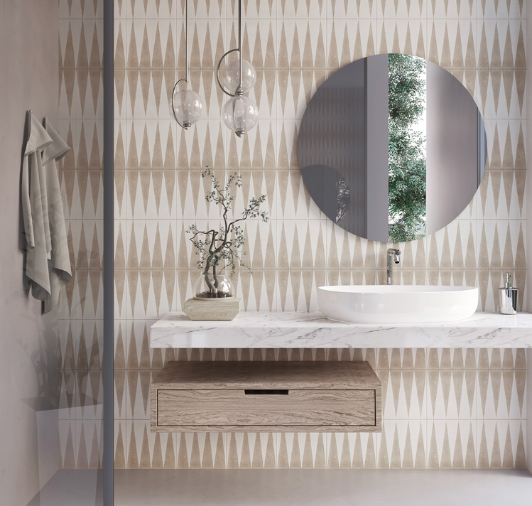
Transform a plain wall into an art installation with geometric tiles in two or three vibrant hues. Hexagons, chevrons, or diamond-cut tiles work especially well when arranged in repeating color patterns. For example, alternating mustard and charcoal hexagon tiles against a cream backdrop creates rhythm and visual intrigue. Ensure precise cuts at edges and corners to keep lines crisp. This accent wall not only adds color but also introduces texture and dimensionality, turning a neutral room into a modern masterpiece.
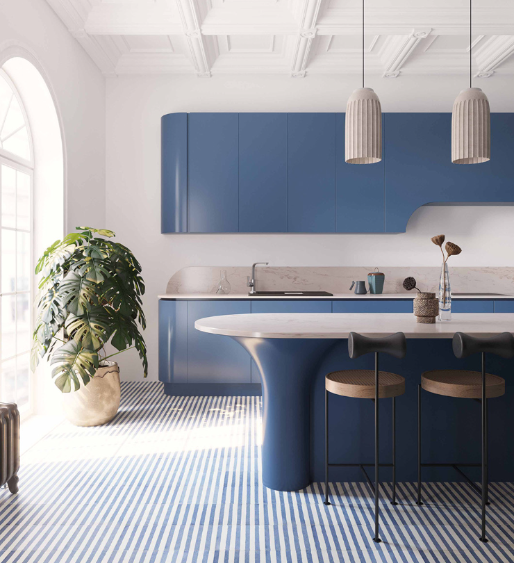
Add color underfoot by inlaying small square or penny-round tile medallions within neutral flooring. For instance, matte black penny rounds arranged in a floral motif on a white tile floor pop without dominating the entire space. Alternatively, a colored square-tile border—cobalt, terracotta, or olive—around a marble tile field subtly frames the room. Because these accents occupy only 5–10% of the floor area, they remain budget-friendly while delivering maximum impact. The floor becomes a curated gallery of color against a neutral canvas.
If you prefer understated tile color, keep tiles neutral (white, beige, or grey) but select grout in vibrant hues—turquoise to energize or charcoal to add drama. This approach transforms standard subway or square tiles into color-blocked graphics. For example, white 3″×6″ tiles with mustard grout form a grid of shifting color that feels modern and playful. Ensure grout lines are uniform and sealed to maintain crisp color lines over time. Colorful grout is a low-commitment hack to infuse color into neutral interiors, easily redone for a fresh look.
Bold hues like emerald, terracotta, or navy are top choices when using tiles to add color to neutral interiors.
Yes—geometric accent walls using two-tone colored tiles create focal interest within minimalist neutral interiors.
Using colorful grout across 100% of a neutral subway tile field ensures consistent color-grid graphics in any room.
Turquoise or charcoal grout pairs exceptionally well when using tiles to add color to neutral interiors with white tiles.
Mixing pastel and bright tiles works if you stick to a cohesive palette when using tiles to add color to neutral interiors.
Otto Tiles & Design LLC
7612 NE 4th Ct, Miami, FL 33138, United States
Phone: (786) 460 9098
Email: info@ottotiles.com
© 2025, Otto Tiles & Design LLC, All rights reserved